.png)
After completing the Aqualung project, I was brought on to complete a similar web redesign for the swimwear line, Aquasphere.
Lead UX / UI Designer | 2018-2020

Project Goals
Build a website that encourages free-spirited swimmers to unleash their full potential in any environment by:
Moving to premium space and defining intuitive product line architecture
Showcase excellence in craftsmanship, innovation, and technology
Empowering swimmers to unleash their potential through industry-leading equipment
Challenges
Aquasphere's customers differed from their parent brand and needed a CX to reflect their unique needs
The site offered a range of goggles each suited for specific use cases
Users are not completing purchase journey
Different Target Audience
Educate Customers
Drop-off / Cart Abandonment
01
Discovery
Stakeholder meetings & data review (keyword search, target demographics, competitor analysis, etc.)
02
Define
Design workshops, identify target users & site goals
03
Wireframe
Present UI options & wireframes
04
Delivery
Complete page designs & hand off clickable prototype to developers
Process
Excerpts from wireframe presentation


Pushing the UI Boundaries
One of the project requirements was to create a shopping experience that reflected Aquasphere's innovative products and premium brand positioning. This meant utilizing modern, clean solutions to achieve an upscale shopping experience.
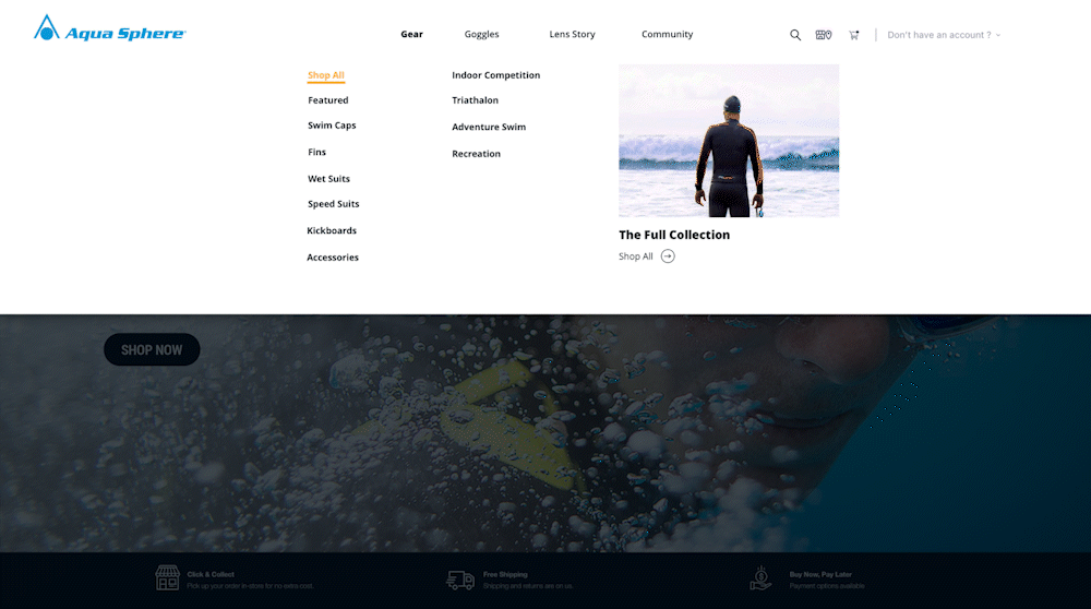
Navigation
Aquasphere's complex product hierarchy required an extensive navigation sub-menus that needed to be displayed in an aesthetically pleasing way while also being responsive in both mobile and web.


Product Display
A hover effect was implemented on web PLP pages to keep the UI from being cluttered by CTAs and product customization options. Filters were targeted toward product use cases for easier product line navigation.
PDP
Emulating modern, clean UI was important on the PDP page so users could easily discern what customization options were available without overwhelming the page. Mobile views were also optimized for smaller device sizes with a sticky CTA button.


Image-driven UI
Aquasphere had invested in top-tier brand imagery which lended to the site's "premium" look and feel.

